
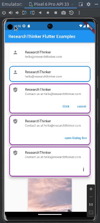
In Flutter, the Card widget is used to create a rectangular container with rounded corners, typically used to group related content together. It provides a visual representation and adds a shadow effect to give a attratcive appearance. It used for various purposes, for better understanding we have implemented multiple type of cards in the below example
The Card widget in Flutter consists of the following properties:
- child (required): The widget that represents the content of the Card. It can be any widget(Text,Container,ListTile etc)
- elevation (default: 1.0): The elevation or depth of the Card, which determines the shadow effect. Higher values result look brighter than background
- shape (default: RoundedRectangleBorder): By default, it uses a RoundedRectangleBorder with rounded corners.
- color: The background color of the Card
- margin: The margin around the Card.
- border: The border around the Card.
Card Example in Flutter
const Card(
//Here in this case we use ListTile in Card widget
                  child: ListTile(
                    leading: Icon(Icons.person),
                    title: Text('ResearchThinker'),
                    subtitle: Text('hello@researchthinker.com'),
                  ),
                ),
Card with highlighted border example in Flutter
const Card(
// Here in this case we use border side blue color and brder radius 15
                  shape: RoundedRectangleBorder(
                      side: BorderSide(color: Colors.blue, width: 3),
                      borderRadius: BorderRadius.all(Radius.circular(15))),
                  child: ListTile(
                    leading: Icon(Icons.person),
                    title: Text('ResearchThinker '),
                    subtitle: Text('hello@researchthinker.com'),
                  ),
                ),
Card with title subtitle and buttons example in Flutter
This card contain various informations inside it , such as Rounded border, child contain Column inside it ListTile with leading , title,subtitle and other container for buttons
Card(
                  shape: RoundedRectangleBorder(
                      side: BorderSide(color: Colors.purple, width: 3),
                      borderRadius: BorderRadius.all(Radius.circular(15))),
                  elevation: 10,
//In this we use Column for multiple widgets
                  child: Column(
                    mainAxisSize: MainAxisSize.min,
                    children: <Widget>[
                      const ListTile(
                        leading: Icon(Icons.verified_user),
                        title: Text('ResearchThinker '),
                        subtitle:
                            Text('Contact us at hello@researchthinker.com'),
                      ),
//This containe multiple buttons inside the card
                      Container(
                          alignment: Alignment.center,
                          child: ButtonBarTheme(
                            // make buttons use the appropriate styles for cards
                            data: ButtonBarThemeData(),
                            child: ButtonBar(
                              children: <Widget>[
                                TextButton(
                                  child: const Text('Click'),
                                  onPressed: () {},
                                ),
                                TextButton(
                                  child: const Text('cancel'),
                                  onPressed: () {},
                                ),
                              ],
                            ),
                          )),
                    ],
                  ),
                ),
Card with Dialogbox option Example in Flutter
Card(
                  shape: const RoundedRectangleBorder(
                      side: BorderSide(color: Colors.purple, width: 3),
                      borderRadius: BorderRadius.all(Radius.circular(15))),
                  elevation: 10,
                  child: Column(
                    mainAxisSize: MainAxisSize.min,
                    children: <Widget>[
                      const ListTile(
                        leading: Icon(Icons.verified_user),
                        title: Text('ResearchThinker '),
                        subtitle:
                            Text('Contact us at hello@researchthinker.com'),
                      ),
                      Container(
                          alignment: Alignment.center,
                          child: ButtonBarTheme(
                            // make buttons use the appropriate styles for cards
                            data: ButtonBarThemeData(),
                            child: ButtonBar(
                              children: <Widget>[
//In this case when user press the button Dialog box will open
                                TextButton(
                                  child: const Text('open Dialog Box'),
                                  onPressed: () => showDialog<String>(
                                    context: context,
                                    builder: (BuildContext context) =>
                                        AlertDialog(
                                      title: const Text('AlertDialog Title'),
                                      content:
                                          const Text('AlertDialog description'),
                                      actions: <Widget>[
                                        TextButton(
                                          onPressed: () =>
                                              Navigator.pop(context, 'Cancel'),
                                          child: const Text('Cancel'),
                                        ),
                                        TextButton(
                                          onPressed: () =>
                                              Navigator.pop(context, 'OK'),
                                          child: const Text('OK'),
                                        ),
                                      ],
                                    ),
                                  ),
                                ),
                              ],
                            ),
                          )),
                    ],
                  ),
                ),
Card with popup menu Example in Flutter
Card(
                  shape: const RoundedRectangleBorder(
                      side: BorderSide(color: Colors.purple, width: 3),
                      borderRadius: BorderRadius.all(Radius.circular(15))),
                  elevation: 10,
                  child: Column(
                    mainAxisSize: MainAxisSize.min,
                    children: <Widget>[
                      const ListTile(
                        leading: Icon(Icons.verified_user),
                        title: Text('ResearchThinker '),
                        subtitle:
                            Text('Contact us at hello@researchthinker.com'),
                      ),
                      Container(
                          alignment: Alignment.center,
                          child: ButtonBarTheme(
                            // make buttons use the appropriate styles for cards
                            data: ButtonBarThemeData(),
                            child: ButtonBar(
                              children: <Widget>[
//In this we use Popup menu which open when user click the button
                                PopupMenuButton(
                                  onSelected: (value) {
                                    print(value);
                                  },
                                  itemBuilder: (BuildContext context) {
                                    return const [
                                      PopupMenuItem(
                                        child: Text("Hello1"),
                                        value: '1',
                                      ),
                                      PopupMenuItem(
                                        child: Text("Hello2"),
                                        value: '2',
                                      ),
                                      PopupMenuItem(
                                        child: Text("Hello3"),
                                        value: '3',
                                      )
                                    ];
                                  },
                                ),
                              ],
                            ),
                          )),
                    ],
                  ),
                ),
Card Contain icon/Image in Flutter Example
  Card(
                  elevation: 5.0,
                  shape: RoundedRectangleBorder(
                    borderRadius: BorderRadius.circular(10.0),
                  ),
//In this we pass Image
                  child: Image.network(
                      'https://picsum.photos/seed/picsum/200/300'),
                ),
Full Code of Card Widget in Flutter
import 'package:flutter/material.dart';

void main() {
  runApp(const MyApp());
}

class MyApp extends StatelessWidget {
  const MyApp({super.key});

  // This widget is the root of your application.
  @override
  Widget build(BuildContext context) {
    return MaterialApp(
      title: 'ResearchThinker',
      debugShowCheckedModeBanner: false,
      theme: ThemeData(
        primarySwatch: Colors.blue,
      ),
      home: const MyAppCardExample(),
    );
  }
}

class MyAppCardExample extends StatelessWidget {
  const MyAppCardExample({super.key});
  @override
  Widget build(BuildContext context) {
    return MaterialApp(
      home: Scaffold(
        appBar: AppBar(
          title: const Text('ResearchThinker Flutter Examples'),
        ),
        body: SingleChildScrollView(
          child: Container(
            padding: EdgeInsets.all(16.0),
            child: Column(
              children: [
                //Simple Cards
                const Card(
                  child: ListTile(
                    leading: Icon(Icons.person),
                    title: Text('ResearchThinker'),
                    subtitle: Text('hello@researchthinker.com'),
                  ),
                ),
                const SizedBox(height: 10.0),

                // Border Highlighted card
                const Card(
                  shape: RoundedRectangleBorder(
                      side: BorderSide(color: Colors.blue, width: 3),
                      borderRadius: BorderRadius.all(Radius.circular(15))),
                  child: ListTile(
                    leading: Icon(Icons.person),
                    title: Text('ResearchThinker '),
                    subtitle: Text('hello@researchthinker.com'),
                  ),
                ),

                // Cards with multiple text and  button
                Card(
                  shape: RoundedRectangleBorder(
                      side: BorderSide(color: Colors.purple, width: 3),
                      borderRadius: BorderRadius.all(Radius.circular(15))),
                  elevation: 10,
                  child: Column(
                    mainAxisSize: MainAxisSize.min,
                    children: <Widget>[
                      const ListTile(
                        leading: Icon(Icons.verified_user),
                        title: Text('ResearchThinker '),
                        subtitle:
                            Text('Contact us at hello@researchthinker.com'),
                      ),
                      Container(
                          alignment: Alignment.center,
                          child: ButtonBarTheme(
                            // make buttons use the appropriate styles for cards
                            data: ButtonBarThemeData(),
                            child: ButtonBar(
                              children: <Widget>[
                                TextButton(
                                  child: const Text('Click'),
                                  onPressed: () {},
                                ),
                                TextButton(
                                  child: const Text('cancel'),
                                  onPressed: () {},
                                ),
                              ],
                            ),
                          )),
                    ],
                  ),
                ),

                // Card  with Dialog box
                Card(
                  shape: const RoundedRectangleBorder(
                      side: BorderSide(color: Colors.purple, width: 3),
                      borderRadius: BorderRadius.all(Radius.circular(15))),
                  elevation: 10,
                  child: Column(
                    mainAxisSize: MainAxisSize.min,
                    children: <Widget>[
                      const ListTile(
                        leading: Icon(Icons.verified_user),
                        title: Text('ResearchThinker '),
                        subtitle:
                            Text('Contact us at hello@researchthinker.com'),
                      ),
                      Container(
                          alignment: Alignment.center,
                          child: ButtonBarTheme(
                            // make buttons use the appropriate styles for cards
                            data: ButtonBarThemeData(),
                            child: ButtonBar(
                              children: <Widget>[
                                TextButton(
                                  child: const Text('open Dialog Box'),
                                  onPressed: () => showDialog<String>(
                                    context: context,
                                    builder: (BuildContext context) =>
                                        AlertDialog(
                                      title: const Text('AlertDialog Title'),
                                      content:
                                          const Text('AlertDialog description'),
                                      actions: <Widget>[
                                        TextButton(
                                          onPressed: () =>
                                              Navigator.pop(context, 'Cancel'),
                                          child: const Text('Cancel'),
                                        ),
                                        TextButton(
                                          onPressed: () =>
                                              Navigator.pop(context, 'OK'),
                                          child: const Text('OK'),
                                        ),
                                      ],
                                    ),
                                  ),
                                ),
                              ],
                            ),
                          )),
                    ],
                  ),
                ),

                // card with popup menu

                Card(
                  shape: const RoundedRectangleBorder(
                      side: BorderSide(color: Colors.purple, width: 3),
                      borderRadius: BorderRadius.all(Radius.circular(15))),
                  elevation: 10,
                  child: Column(
                    mainAxisSize: MainAxisSize.min,
                    children: <Widget>[
                      const ListTile(
                        leading: Icon(Icons.verified_user),
                        title: Text('ResearchThinker '),
                        subtitle:
                            Text('Contact us at hello@researchthinker.com'),
                      ),
                      Container(
                          alignment: Alignment.center,
                          child: ButtonBarTheme(
                            // make buttons use the appropriate styles for cards
                            data: ButtonBarThemeData(),
                            child: ButtonBar(
                              children: <Widget>[
                                PopupMenuButton(
                                  onSelected: (value) {
                                    print(value);
                                  },
                                  itemBuilder: (BuildContext context) {
                                    return const [
                                      PopupMenuItem(
                                        child: Text("Hello1"),
                                        value: '1',
                                      ),
                                      PopupMenuItem(
                                        child: Text("Hello2"),
                                        value: '2',
                                      ),
                                      PopupMenuItem(
                                        child: Text("Hello3"),
                                        value: '3',
                                      )
                                    ];
                                  },
                                ),
                              ],
                            ),
                          )),
                    ],
                  ),
                ),

                // card contain image
                Card(
                  elevation: 5.0,
                  shape: RoundedRectangleBorder(
                    borderRadius: BorderRadius.circular(10.0),
                  ),
                  child: Image.network(
                      'https://picsum.photos/seed/picsum/200/300'),
                ),
              ],
            ),
          ),
        ),
      ),
    );
  }
}