
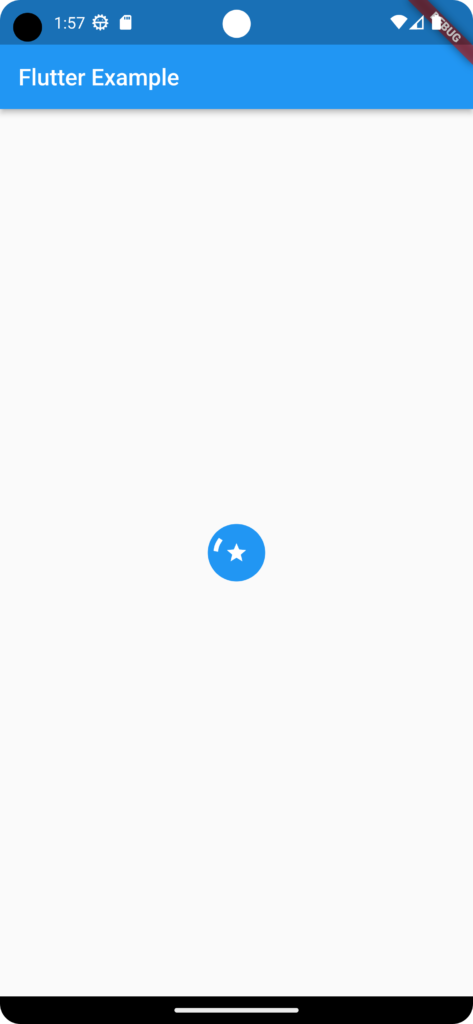
In this example, If you want to display a circular loading indicator containing an icon, you can use the CircularProgressIndicator along with the Icon widget.
import 'package:flutter/material.dart';

void main() {
  runApp(MyApp());
}

class MyApp extends StatelessWidget {
  @override
  Widget build(BuildContext context) {
    return MaterialApp(
      home: Scaffold(
        appBar: AppBar(
          title: Text('Circular Bar with Icon Example'),
        ),
        body: CircularBarWithIcon(),
      ),
    );
  }
}

class CircularLoadingWithIcon extends StatelessWidget {
  @override
  Widget build(BuildContext context) {
    return Center(
      child: Container(
        width: 50.0,
        height: 50.0,
        decoration: BoxDecoration(
          shape: BoxShape.circle,
          color: Colors.blue, // Change the color as needed
        ),
        child: Center(
          child: Stack(
            alignment: Alignment.center,
            children: [
              CircularProgressIndicator(
                valueColor: AlwaysStoppedAnimation<Color>(Colors.white),
              ),
//Replace below section with Image
//Image.asset(
     //       'assets/logo.png', // Replace with your logo asset path
      //      width: 100.0, // Adjust the size of the logo as needed
       //     height: 100.0,
        //    fit: BoxFit.contain,
        //  ),
              Icon(
                Icons.star, // Replace with the desired icon / image
                size: 20.0, // Adjust the size of the icon as needed
                color: Colors.white, // Adjust the color of the icon as needed
              ),
            ],
          ),
        ),
      ),
    );
  }
}