

In Flutter, a TabBar is a widget that allows you to create a set of tabs, typically displayed horizontally, which the user can interact with to switch between different content views. It provides a convenient way to organize and navigate between multiple sections or screens within your app.
The TabBar widget is often used in combination with the TabBarView widget, which displays the content corresponding to each tab. The TabBarView widget is typically placed inside a widget like a TabController or DefaultTabController to manage the state and synchronization of the selected tab.
Flutter Tab bar Example
import 'package:flutter/material.dart';
import 'package:flutter/material.dart';
void main() {
runApp(const MyApp());
}
class MyApp extends StatelessWidget {
const MyApp({super.key});
// This widget is the root of your application.
@override
Widget build(BuildContext context) {
return MaterialApp(
title: 'ResearchThinker',
debugShowCheckedModeBanner: false,
theme: ThemeData(
primarySwatch: Colors.blue,
),
home: TabBarExample2(),//ResearchThinkerExample(),
);
}
}
class TabBarExample2 extends StatelessWidget {
const TabBarExample2({super.key});
@override
Widget build(BuildContext context) {
return DefaultTabController(
initialIndex: 1,
length: 3,
child: Scaffold(
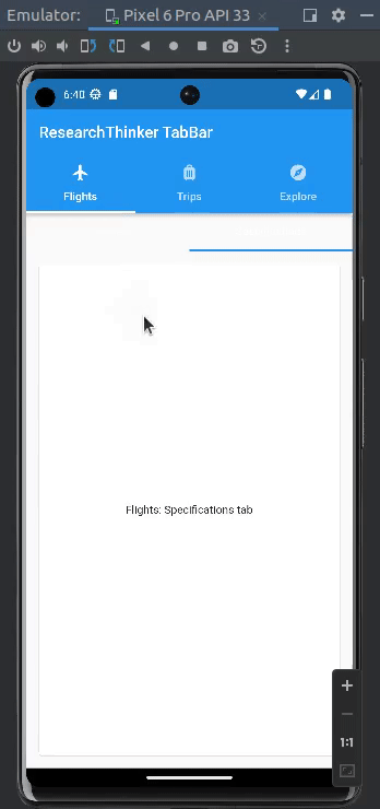
appBar: AppBar(
title: const Text('ResearchThinker TabBar'),
bottom: const TabBar(
dividerColor: Colors.transparent,
tabs: <Widget>[
Tab(
text: 'Flights',
icon: Icon(Icons.flight),
),
Tab(
text: 'Trips',
icon: Icon(Icons.luggage),
),
Tab(
text: 'Explore',
icon: Icon(Icons.explore),
),
],
),
),
body: const TabBarView(
children: <Widget>[
NestedTabBar('Flights'),
NestedTabBar('Trips'),
NestedTabBar('Explore'),
],
),
),
);
}
}
class NestedTabBar extends StatefulWidget {
const NestedTabBar(this.outerTab, {super.key});
final String outerTab;
@override
State<NestedTabBar> createState() => _NestedTabBarState();
}
class _NestedTabBarState extends State<NestedTabBar>
with TickerProviderStateMixin {
late final TabController _tabController;
@override
void initState() {
super.initState();
_tabController = TabController(length: 2, vsync: this);
}
@override
void dispose() {
_tabController.dispose();
super.dispose();
}
@override
Widget build(BuildContext context) {
return Column(
children: <Widget>[
TabBar(
controller: _tabController,
tabs: const <Widget>[
Tab(text: 'Overview'),
Tab(text: 'Specifications'),
],
),
Expanded(
child: TabBarView(
controller: _tabController,
children: <Widget>[
Card(
margin: const EdgeInsets.all(16.0),
child: Center(child: Text('${widget.outerTab}: Overview tab')),
),
Card(
margin: const EdgeInsets.all(16.0),
child: Center(
child: Text('${widget.outerTab}: Specifications tab')),
),
],
),
),
],
);
}
}
In this example, we define a list of Tab widgets and create a TabController with the number of tabs. The TabBar widget is then used to display the tabs, and the TabBarView widget is used to display the corresponding content for each tab. The TabController is assigned to both the TabBar and TabBarView to keep them in sync.
You can customize the appearance of the TabBar by specifying different properties such as the tab’s label, icon, or even custom widgets. Additionally, you can handle the user’s interaction with the tabs by listening to the TabController’s events, such as onTap or onTabChanged.