Flutter Tutorial
Install Flutter in Win/Linux/Mac
Flutter Widgets:
Bottom Navigation Bar in Flutter
Auto Close Keyboard in Flutter
Screen size handling in Flutter
Flutter REST API
Flutter Advance
Wrap vs Builder vs OverBarFlow
Circular progress contain Icon
Flutter State management Comparison
Flutter Database
Flutter Token Expired Handling
Flutter Provider
Flutter GetX
Flutter with Native
Flutter Tips
Interview Questions
Flutter Drawer

A Drawer in Flutter is a slide-in menu that is typically used to provide navigation options in an application. It’s hidden off-screen and can be revealed by swiping from the left edge of the screen or by tapping on a menu icon. The Drawer widget is often placed in the Scaffold widget, providing a convenient way to implement navigation menus.
Where to Use:
- Navigation: A common use case is to house navigation links or options, allowing users to switch between different sections or screens of the application.
- Settings: Drawers can also contain settings or user preferences, making it easy for users to customize the app.
Benefits:
- Space Optimization: Drawers help optimize screen space by providing a way to organize and present secondary options or features without cluttering the main screen.
- Consistent Navigation: They offer a consistent way to implement navigation, making it easy for users to understand how to access different parts of the app.
- User Engagement: Users can access additional functionality or information without leaving the current screen, improving user engagement.
Add a Drawer to Scaffold
Scaffold(
  appBar: AppBar(
    title: Text('My App'),
  ),
  drawer: Drawer(
    // Drawer content goes here
  ),
  body: // Main content goes here,
)
Populate Drawer with Items
Drawer(
  child: ListView(
    padding: EdgeInsets.zero,
    children: [
      DrawerHeader(
        decoration: BoxDecoration(
          color: Colors.blue,
        ),
        child: Text('Drawer Header'),
      ),
      ListTile(
        title: Text('Option 1'),
        onTap: () {
          // Handle option 1
        },
      ),
      ListTile(
        title: Text('Option 2'),
        onTap: () {
          // Handle option 2
        },
      ),
    ],
  ),
)
Open and Close Drawer
To open the drawer, you can use a leading icon in the AppBar or swipe from the left edge of the screen. To close the drawer, the user can tap outside the drawer or swipe it back
import 'package:flutter/cupertino.dart';
import 'package:flutter/material.dart';

class MyHomePage extends StatefulWidget {
  const MyHomePage({super.key, required this.title});
  final String title;
  @override
  State<MyHomePage> createState() => _MyHomePageState();
}

class _MyHomePageState extends State<MyHomePage> {
  // int _counter = 0;
bool enable=false;
  // void _incrementCounter() {
  //   setState(() {
  //     _counter++;
  //   });
  // }

  @override
  Widget build(BuildContext context) {
    return Scaffold(
      appBar: AppBar(
        title: Text('Flutter Drawer Example'),
      ),
      drawer: Drawer(
        child: ListView(
          padding: EdgeInsets.zero,
          children: [
            DrawerHeader(
              decoration: BoxDecoration(
                color: Colors.blue,
              ),
              child: Text('Drawer Header'),
            ),
            ListTile(
              title: Text('Option 1'),
              onTap: () {
                // Handle option 1
                Navigator.pop(context); // Close the drawer
              },
            ),
            ListTile(
              title: Text('Option 2'),
              onTap: () {
                // Handle option 2
                Navigator.pop(context); // Close the drawer
              },
            ),
          ],
        ),
      ),
      body: Center(
        child: Text('Main Content'),
      ),
    );
  }
}
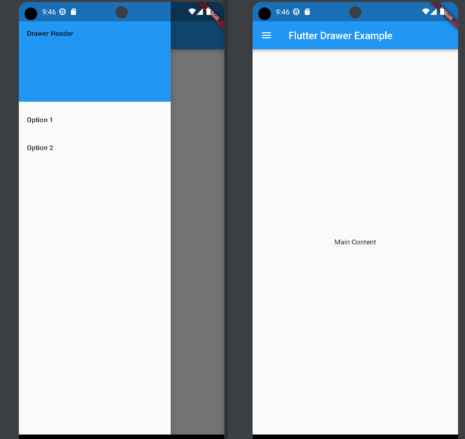
In this example, the Drawer contains a header and two list items. Tapping on the items could trigger navigation to different sections or perform specific actions. The Navigator.pop(context) is used to close the drawer after an option is selected.
Note: Adjust the content of the Drawer based on your application’s requirements and design preferences.


