Flutter Tutorial
Install Flutter in Win/Linux/Mac
Flutter Widgets:
Bottom Navigation Bar in Flutter
Auto Close Keyboard in Flutter
Screen size handling in Flutter
Flutter REST API
Flutter Advance
Wrap vs Builder vs OverBarFlow
Circular progress contain Icon
Flutter State management Comparison
Flutter Database
Flutter Token Expired Handling
Flutter Provider
Flutter GetX
Flutter with Native
Flutter Tips
Interview Questions
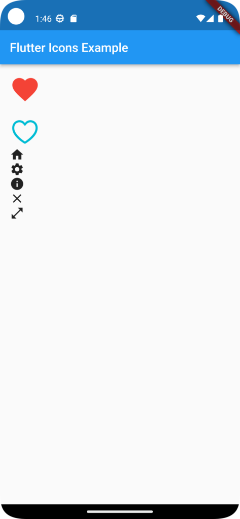
Flutter Icons Example

In Flutter, Icons is a pre-defined class that provides a wide range of icon options to use in your Flutter applications. The Icons class is part of the Flutter material library and offers a collection of icons that follow the Material Design guidelines. Here’s a detailed description of Icons with an example:
To use icons from the Icons class, follow these steps:
Import the material.dart file:
import 'package:flutter/material.dart';Access icons using the Icons class:
Icon(Icons.check),In this example, we use the Icon widget and pass Icons.check as the icon to display. The Icons.check represents a checkmark icon from the available icon set.
The Icons class provides a variety of icons, including basic icons, action icons, navigation icons, and more. Here are a few examples:
Basic icons
Icon(Icons.home),

Icon(Icons.settings),

Icon(Icons.info),
Action icons
Icon(Icons.favorite),

Icon(Icons.share),

Icon(Icons.search),
Navigation icons
Icon(Icons.arrow_back),

Icon(Icons.menu),

Icon(Icons.close),
You can find a comprehensive list of available icons in the Flutter SDK documentation: Icons class.
To display an icon, wrap the Icon widget around the desired icon and provide it as the child of another widget, such as IconButton, RaisedButton, or any other widget that supports an icon property.Icons can be customized using properties like size, color, and semanticLabel. For example:
Icon(

  Icons.star,

  size: 32,

  color: Colors.yellow,

  semanticLabel: 'Star Icon',

),
In this example, we set the size of the icon to 32 pixels, the color to yellow, and provide a semantic label for accessibility purposes.
Full Code:
import 'package:flutter/cupertino.dart';
import 'package:flutter/material.dart';

class MyHomePage extends StatefulWidget {
  const MyHomePage({super.key, required this.title});
  final String title;
  @override
  State<MyHomePage> createState() => _MyHomePageState();
}

class _MyHomePageState extends State<MyHomePage> {
  // int _counter = 0;
bool enable=false;
  // void _incrementCounter() {
  //   setState(() {
  //     _counter++;
  //   });
  // }

  @override
  Widget build(BuildContext context) {
    return MaterialApp(
      home: Scaffold(
        appBar: AppBar(
          title: Text('Flutter Icons Example'),
        ),
        body: Padding(
          padding: const EdgeInsets.all(16.0),
          child: Column(
            crossAxisAlignment: CrossAxisAlignment.start,
            children: [
              // Material Design Icons
              Icon(Icons.favorite, size: 50, color: Colors.red),
              SizedBox(height: 20),
              // Cupertino Icons
              Icon(CupertinoIcons.heart, size: 50, color: Colors.cyan),
              Icon(Icons.home),
              Icon(Icons.settings),
              Icon(Icons.info),


              Icon(Icons.close),

              //Icon with Clickable

              InkWell(
                      child: Icon(Icons.open_in_full),
                      onTap:(){
                      print("ANYTHINGH YOU CAN PRINT / PERFORM OPERATION");
                              },
                     ),
            ],
          ),
        ),
      ),
    );
  }


