Navigation rail in flutter
Flutter Tutorial
Install Flutter in Win/Linux/Mac
Flutter Widgets:
Bottom Navigation Bar in Flutter
Auto Close Keyboard in Flutter
Screen size handling in Flutter
Flutter REST API
Flutter Advance
Wrap vs Builder vs OverBarFlow
Circular progress contain Icon
Flutter State management Comparison
Flutter Database
Flutter Token Expired Handling
Flutter Provider
Flutter GetX
Flutter with Native
Flutter Tips
Interview Questions
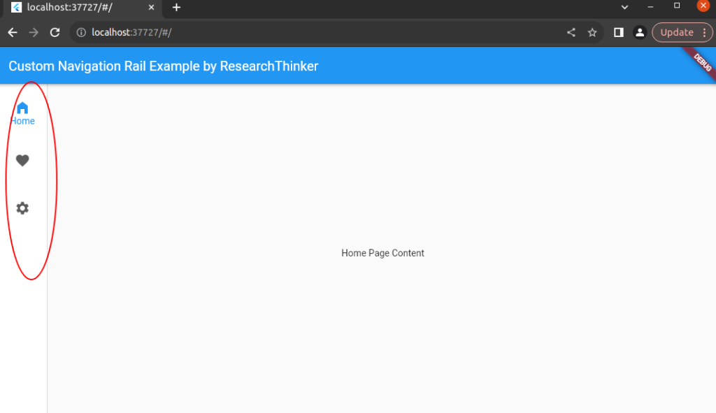
Navigation rail in Flutter is vertical bar or column of buttons/icons typically found on one side of a flutter app(mobile/web) or user interface. Each button represents a different section or destination within the app. When a user taps one of these buttons, button taken to the corresponding section of the app, just like a Tab bar in flutter which when user click tab the corresponding section is open functionality in Flutter.
In simple words, it like a sidebar menu, but in a vertical orientation. It provides an easy way for users to navigate between different parts of an application. The selected button is visually highlighted to show the user which section of the app they are currently viewing. In this code we are using three Navigation rail and we run inbrowser , you can run in mobile app there is no dependenices require for it.

import 'package:flutter/material.dart';

void main() {
  runApp(MyApp());
}

class MyApp extends StatelessWidget {
  @override
  Widget build(BuildContext context) {
    return MaterialApp(
      home: MyHomePage(),
    );
  }
}

class MyHomePage extends StatefulWidget {
  @override
  _MyHomePageState createState() => _MyHomePageState();
}

class _MyHomePageState extends State<MyHomePage> {
//By default Index value is 0 mean Home
  int _currentIndex = 0;

  @override
  Widget build(BuildContext context) {
    return Scaffold(
      appBar: AppBar(
        title: Text('Custom Navigation Rail Example by ResearchThinker'),
      ),
      body: Row(
        children: [
          CustomNavigationRail(
            currentIndex: _currentIndex,
            onItemSelected: (int index) {
              setState(() {
                _currentIndex = index;
              });
            },
          ),
          VerticalDivider(thickness: 1, width: 1),
          Expanded(
            child: Center(
              child: _getPageContent(_currentIndex),
            ),
          ),
        ],
      ),
    );
  }
//We are using switch case to show selected index data. You can modify and any widget in it

  Widget _getPageContent(int index) {
    switch (index) {
      case 0:
        return Text('Home Page Content');
      case 1:
        return Text('Favorites Page Content');
      case 2:
        return Text('Settings Page Content');
      default:
        return Text('Invalid Index');
    }
  }
}

//This is the custom code of Navigation Rail you can change according to your requirements

class CustomNavigationRail extends StatelessWidget {
  final int currentIndex;
  final Function(int) onItemSelected;

  const CustomNavigationRail({
    required this.currentIndex,
    required this.onItemSelected,
  });

  @override
  Widget build(BuildContext context) {
    return NavigationRail(
      selectedIndex: currentIndex,
      onDestinationSelected: onItemSelected,
      labelType: NavigationRailLabelType.selected,
      destinations: [

//Here if you want to add more icons in Rail then you have add NavigationRailDestination here and also update above switch case

        NavigationRailDestination(
          icon: Icon(Icons.home),
          selectedIcon: Icon(Icons.home_filled),
          label: Text('Home'),
        ),
        NavigationRailDestination(
          icon: Icon(Icons.favorite),
          selectedIcon: Icon(Icons.heart_broken_sharp),
          label: Text('Favorites'),
        ),
        NavigationRailDestination(
          icon: Icon(Icons.settings),
          selectedIcon: Icon(Icons.settings),
          label: Text('Settings'),
        ),
      ],
    );
  }
}


